There is no greater proof that ‘people make Glasgow’ than to see the city without its crowds. The city centre has been dormant, feeling like a stage without a play. Now, the commuters and shoppers are returning from their Covid-enforced isolation and the redeveloped Glasgow Queen Street station is there to welcome them. Edward Dymock is an Associate Architect at BDP’s Glasgow Studio and was Lead Architect for EGIP’s redevelopment of Glasgow Queen Street Station to the end of detail design. Here, he takes up the story.
BDP
Cities are, when they work well, efficient systems for living and, therefore, play an important role in our fight against climate change. It is in all of our interests that cities remain busy centres for living, commerce and leisure. Investment in our cities and their infrastructure must both facilitate and promote a greener way of life.
To achieve both these things on its constrained city centre site, Glasgow Queen Street’s new architecture and design have been shaped by the movement of the people that will use it.
Glasgow Queen Street, the third busiest station in Scotland, has been redeveloped to support greener travel and celebrate its city. The station has been expanded to cope with significant increases in passenger numbers, aiding the transition from car to green electric trains. Its dramatic new concourse encourages this transport choice.
Before the redevelopment, I would describe Queen Street Station as not only at the end of the line, it was at the end of its life. The station needed to be upgraded, reorganised and expanded to cope with the projected 90% increase in passenger footfalls over the next 30 years. The longer trains delivering those passengers required longer platforms.
The constraints of the tunnel throat meant a significant part of the platform extensions would be southward, displacing the concourse from beneath the train shed to the area between its fanlight and West George Street. Despite the compulsory purchase of the bedroom wing of the Millennium Copthorne Hotel, partly for the safety zones associated with new buffers, the site was still constrained. The new concourse’s architecture had to work hard to provide the functionality required.
A railway station concourse has two primary, and often contradictory, roles. It has to allow people to move and also to congregate. To achieve the former, we needed to ensure passengers would move around the station intuitively. This meant creating a legible architecture that considers the passengers’ desired routes. Better still, the architecture would actually ‘show’ them the way.
Allowing people to congregate means not only ensuring the concourse is the right size and shape but also designing a space that intuitively suggests where people stand, sit and queue, so movement can happen simultaneously. On a larger site, we would also include retail outlets for the passengers as they wait – very much the realm of contemporary airport design and rail stations such as King’s Cross. The lion’s share of Queen Street’s retail is intended to come in a later development on its former taxi rank.
To understand how best to allow passengers to move around the site efficiently, and determine the appropriate concourse size, the design team worked with a movement specialist, Movement Strategies, to analyse the use of the old station. Bluetooth surveys and CCTV analysis were used to map passenger movement. This gave the design team insights into the percentages of passenger movements through the west-facing exit (around 70%) relative to the much smaller numbers heading to George Square and the taxi rank to the east.
Growth forecasts allowed extrapolation of the survey data to provide the anticipated footfalls in each direction. Given the role of the station, we focused on the peak periods for commuter flows. We also had to ensure the concourse would cope with scenarios such as periods of perturbation – when trains are delayed and concourse populations swell.
Movement Strategies confirmed that the new concourse would need to include space occupied by the adjoining hotel’s bedroom wing and Consort House – an office building on the south-west corner of the site. Even then, space was still tight. We needed to create a design that was instinctive to use. One not cluttered by signage, but one that exploited the building form and views of the city to orientate passengers and direct them to their destination.
Having determined that most passenger movement was westward, we divided this flow between a Dundas Lane entrance (also serving the subway) and a West George Street entrance. This split allowed a level threshold to Dundas Street and a flight of stairs rising two metres from West George Street. This purposely created an area between the entrances in which we could position the ticket office, ticket machines and waiting room. We positioned the Dundas Street entrance so ScotRail trains’ livery is now visible from Glasgow’s main shopping thoroughfare, Buchanan Street.
We aligned the George Square entrance with the end of Queen Street and made it much wider than flows required to provide the appropriate gesture to the city’s main civic space.
The low-level station was not included in the project scope, but we improved its approaches too. We allowed direct movement to its foyer from platform two and used a single gate line to access both high- and low-level platforms.
Once the concourse layout was determined, dynamic modelling software was used to check we met Network Rail’s performance requirements for crowd densities, especially the peak morning and evening flows. Each period creates its own challenges: the morning peak puts more pressure on the platforms and gate line and the evening peak puts more pressure on the concourse. Movement Strategies’ digital simulations of trains arriving and departing provided us with fascinating insights into the changing concourse densities, and allowed fine-tuning of entrance widths and the gate line shape to ensure every part of the new terrazzo floor was contributing to the concourse’s performance.
Extending and optimising the station’s layout is only one aspect of the new design. We wanted to create an architecture that celebrated the transition from city to train and train to city; a building that provided a memorable and warm ‘Welcome to Glasgow’. To do this, we exploited the unique qualities of the site: its incredible views of the city centre and the presence of the historic train shed.
The train shed’s supporting structure had been hidden by previous ‘modernisation’ in the 1960s. We revealed its Corinthian columns and used flat planes of stone and aluminium to ensure new structures did not visually compete with the fine Victorian detailing. We created a new clerestory window that separated new from old and provided views of the train shed roof from within the concourse. The glazing is positioned to provide new perspectives of the fanlight as you inspect the new customer information screen, and so that light floods into the low-level stairs.
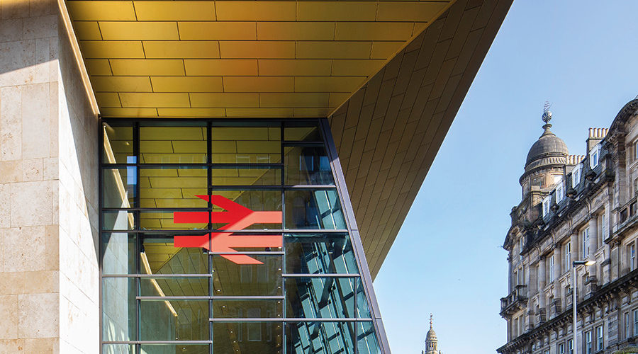
The old Queen Street was a gloomy, depressing place. Today, the play of light across its planes of stone and ‘gold’ anodised aluminium is a pleasure. The quality of daylight inside the train shed has been improved dramatically too.
Modelling of light during the design stage allowed BDP’s lighting designers to understand how the lighting character would change with the time of day and the seasons. Together, we created integrated lighting solutions so the building’s striking materials provide a warm welcome on a dreich Glasgow afternoon and into the night. Passengers are guided by energy-efficient integrated light sources and handrail lights from the platform through to the street. Lighting has become an integral part of the new station, celebrating its dramatic forms, contributing to its civic presence and reinforcing its ‘beacon-like’ quality.
Previously, on arrival at Queen Street’s platforms, the city was hidden. Now Glasgow is the star of the show. As the new concourse ceiling is angled upwards, it is the views of the historic fanlight and of the city that first greet you. Only as you approach the gate line does the drama of the form and colour of the concourse roof provide a memorable end to your journey.
The new roof is used as a unifying element that defines the extent of the concourse and signals each of its entrances. It folds down at the George Square entrance, turns the corner at the West George Street entrance, and folds again to guide you to the subway as you exit to Dundas Street. Here, a deep inflection in the facade ensures the roof is always ‘welcoming’ you.
BDP viewed the Edinburgh Glasgow Improvement Programme’s redevelopment of the station as an opportunity to assert Scotland’s confidence in the future of rail with a building that celebrates the passengers’ transport choice. The station is not just a welcoming, accessible building that now caters for increased footfalls, but an extrovert place with an enticing civic presence – a building that hopefully will bring a little delight and pride to all who use it.
The COVID-19 pandemic has, I hope, taught us all how fragile our relationship is to this planet. It has firmly moved the climate change debate from the realm of scientists and activists to an understanding that collective action is essential. Rail travellers should be proud of Glasgow Queen Street. It will become the figurehead of a rapidly-greening transport network. Every passenger and visitor moving freely under its new gold roof can celebrate that they are making positive transport choices.


