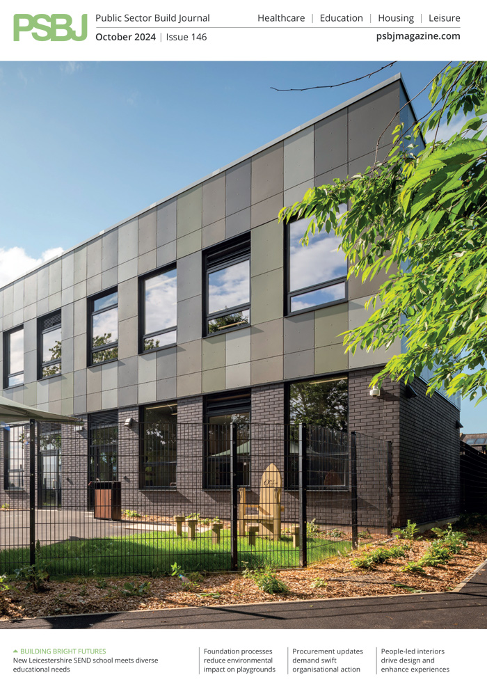
In healthcare environments, the wellbeing and comfort of patients are paramount, and the power of design in achieving this should not be underestimated. In particular, when it comes to managing the side effects of dementia, appropriate colour and pattern selection can have a profound effect on easing distress. Here, Donna Taylor, Principal Colour Consultant at PPG, explores what designers can do to help improve the lives of those living with dementia.
Johnstones Trade


In recent times, there have been increasing efforts to protect vulnerable people in the UK. One of the earlier and most influential developments was the Equalities Act 2010, which was created to offer protection against discrimination across all areas of society. Consideration of how the design of public buildings can impact various disabilities and conditions, including dementia, was a large part of this legislation.
Dementia is a term used to encompass various diseases that affect the neurological function of the brain and goes beyond difficulties with memory recollection. These degenerative diseases often lead to symptoms such as aggression, anxiety and confusion, as well as problems with depth perception and other vision-related conditions – all of which can be exacerbated through poorly chosen design schemes. This makes colour selection particularly important in environments occupied by those living with dementia.
Over 850,000 people suffer from dementia in the UK alone, according to the Alzheimer’s Society – a figure that is expected to rise to one million by 2025. Given these statistics, it has never been more pertinent to consider the impact interior design can have in care homes and healthcare facilities.
Creating a contrast
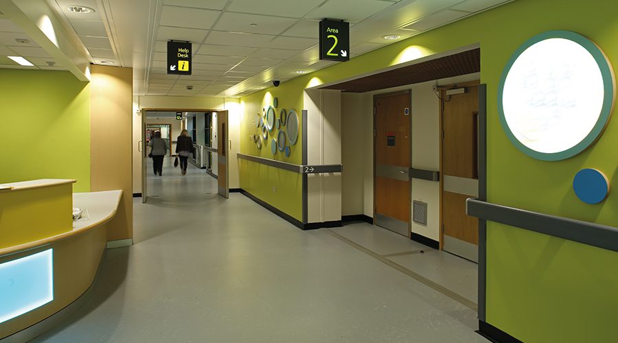
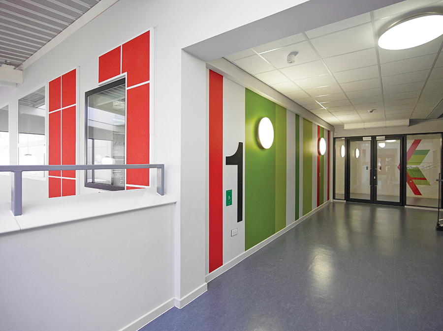
One of the most common symptoms of dementia is difficulties with perception. Using a strong enough contrast in colour hue and tone goes a long way to help with individuals’ ability to understand the size and shape of a room and, therefore, helps them successfully navigate objects within it and avoid any unnecessary distress.
Determined by a Light Reflectance Value (LRV), colour contrasting is the most fundamental part of dementia design. Each colour is measured by its LRV and given a number between 0 and 100. Different surface elements within the design scheme will need to have an LRV difference of at least 30 points to help patients distinguish between items such as furniture, flooring, doors and walls. Striking a perfect balance will create a visual perspective, while achieving a 3D appearance to prevent the room from feeling flat.
Similar colour hues and irregular patterns can increase confusion and disorientation. To avoid this, designers should use simplistic, delicate patterns on all interior design elements, rather than geometric patterns, for example, which may trigger optical illusions. Lifelike floral patterns also present a particular problem as their similarity may lead to patients picking at the design, aggravating their anxieties further.
A harmonious scheme
These design techniques are incredibly important as we naturally associate colour with feelings and emotions on a subconscious level. And when it comes to more sensitive environments where a person’s health is at risk, such as hospitals or care homes, the impact of colour can be accentuated. Holding the potential to impact a patient’s recovery or prolong their treatment through increased stress, colour selection within the entirety of a building is of vital importance.
However, it’s important to emphasise that as colour perception is subjective, there really are no catch-all solutions. Instead, the importance lies in creating a harmonious environment by combining colour alongside other design elements. Everything needs to work together, from the flooring to the furniture and the wallpaper to the soft furnishings.
Finding your way with colour
Colour cannot only help with depth perception and impact how we visualise a space, but it is also useful when it comes to direction. Wayfinding techniques are often used throughout healthcare spaces to help patients navigate their way around buildings, therefore, helping to prevent disorientation. For example,
a consistent colour scheme should be used on accent walls, doors, exits and help desks to help patients identify these focal points.
Wayfinding design also helps to prevent patients from accessing dangerous areas, such as medical cabinets and storerooms. In these scenarios, blending the door colour into the surrounding walls will help to disguise these areas and, therefore, avoid potentially harmful situations.
Of course, it’s true that even the best design and colour selection cannot cure dementia patients of their symptoms, but it is still a crucial part of easing any discomfort and enabling more independent living. By taking the above into consideration, you’re placing the end-user at the centre of the design process and, in doing so, ensuring that their comfort and wellbeing are maximised in what can otherwise be a confusing and troubling time.